Saturday, 26 November 2011

Glam Rock Artists

These are some artists who are classed in the category of Glam Rock:-
Alice Cooper
Bay City Rollers
Bryan Ferry
David Bowie
David Essex
Elton John
Gary Glitter
Iggy Pop
KISS
New York Dolls
Queen
Roxy Music
T.Rex
The Velvet Underground
The Darkness
Scissor Sisters


These are artists heavily influenced by these artists: -
The Auteurs
Cheap Trick
Guns N' Roses
Manic Street Preachers
Marilyn Manson
Placebo
Poison
W.A.S.P.


The Name

I have come up with various names of which I can call my magazine:

Friday, 25 November 2011

Institution

I think my magazine would fit in with the institution ‘Emap’. Institutions such as IPC Media and Bauer already publish music magazines similar to the one I will produce (NME and Kerrang) so there would not be a gap here. The BBC has three music magazines: It’s Hot, Top of the Pops, and Classical Music Magazine. There is a gap here for a rock magazine but considering it is the BBC, I don’t think it would be an appropriate genre for them and the features I would put in my magazine would be limited because they have strict rules on what you can and cannot say.
Emap specialises predominately in the ‘b2b’ (business to business) publishing space and publishes magazines for nursing, retail and media. Smash Hits was Emap’s music magazine until 2006 which ran bi-weekly, primarily focussed on pop music – aimed at young teenage girls. Its content includes pop groups and artists, gossip and fashion. Smash Hits and Top of the Pops were rival magazines trying to compete for higher market share at the same defined audience.

Audience

My target market for my magazine will be in the age bracket of 16-25. I have chosen a younger generation to coincide with the genre of ‘Glam Rock’. In this day and age, music is as much to do with image as it is with music. The way a band or artist looks and behaves on stage effects how their music is perceived – I think their attitudes are inspirational for many young people who follow this particular fashion or want to break into the music industry. The people who read my magazine will be those who are hooked to music, who are constantly looking for new artists and those who are regularly appearing at gigs. They will love the atmosphere of live events and find the air as exciting as the music.
Each week, the magazine will provide updates on the latest and biggest acts to keep the readers conversant and make them feel that this is the place to come if you want to be the first to hear the latest news first. Considering the demographics of my target market, the issues for my magazine should be affordable for those in the social grades of ABC1C2 – those in this category can spend their money on luxuries like music magazines whereas this may not be a common purchase for those in the D and E subdivision of society. My audience will be either working full time, part time or as a full time student. I would want my magazine to be an appropriate price because here in 2011, with institutions like Apple and programs like iTunes (which is free) provide a catalogue of albums, user reviews, album art, Internet radio, and podcast listings for free as well. People are more willing to buy music because it has become as easy as a humble click of the mouse to attain a new album or single, however, this has caused a massive turn in the music industry as people don’t feel the need to buy a magazine with the information so they are being gradually debased throughout the generations. Apple gives away a new single every week, so users can expand their music collection without any commitment to buy anything – Apple can afford this because they make most of their profit margin on the various hardware devices.
The readers who will buy the magazine on a regular basis will be passionate about music and feel it practically dominates their lives. They will happily treat themselves to music tracks via iTunes or buying albums from the few remaining music stores in the UK.

Rock Genre

I have chosen 'rock' as the genre of my magazine, however it can be divided into many sub-genres. I will focus mainly on glitter/glam rock. 


Genre Possibilities

These are the different genres my magazine could be revolved around:-
- country/folk
- rock
- pop
- R&B
- hip-hop/rap
- classical
- dance
- electronic
- jazz
- world

Sunday, 20 November 2011

LIIAR Analysis of NME Contents Page


The contents page for this edition of NME contains the iconic title “NME” with the font, colours and house style from the front cover which shows consistency and efficiency. The layout and structure is clear and gives the reader a clear understanding of where to find specific articles.
The sub-headings organises the contents making it easier for the reader to glance at without having to read the full page in detail. The image is dynamic and reflects the genre of the magazine which engages the audience.
This contents page comprises a ‘taster article’ giving consumers an insight into the magazine. A noticeable puff is used at the bottom of the page in out-standing yellow writing saying “subscribe today for just £5.57 a month” – the word ‘just’ makes it seem like this is an amazing deal and is a persuasive technique used by the publisher as a way of getting people to read the magazine on a regular occasion. There is a detailed ‘band index’ which is useful for people who just want to read about a certain band or want to find out which bands are mentioned in the magazine – this feature is appealing to those whose favourite bands are mentioned. There is the use of ellipsis leading into the heading as well which increases excitement and suspense for the reader “the moment that…”

LIIAR Analysis of Music


The layout of this magazine consists of a short and dynamic title, a heading, other articles (these are put under a subheading saying “also in this issue” to make readers aware), a barcode, other artists which are included in the magazine.
The man in the main image is making eye contact with the audience and is an MCU. His face is clear with a pleased expression on his face. The subject is holding an award indicating he is one of the winners of the 2010 awards. He is dressed in a dark suit which is common for a classical music performer to wear. It the brand image represents classical music as mature and sophisticated.
“The best disks and the greatest artists – as voted by you” – this language is very direct and it is written as if they are speaking to the reader personally. There is the use of superlatives in this phrase to emphasise and exaggerate the talent of the musicians featured in the magazine, intensifying the readers’ interest. The heading “Winners Revealed!” is written in gold, it is upper-class lettering, and ends with an exclamation mark to raise enthusiasm and excitement. The gold also reflects the awards theme and the idea of winning 1st prize.
The colour scheme consists of two colours: black and gold which is presented on a light background – the black and white links to the idea of classical sheet music of which musicians use in their performances. The text uses anchorage by featuring one of the winners of the 2010 awards – this is relevant to what articles the magazine will feature and its target audience who are interested in classical music. The institution for this magazine is BBC. It is published monthly in the United Kingdom by BBC Worldwide, the commercial subsidiary of the BBC. Reflecting the broadcast output of BBC Radio 3, the magazine is devoted primarily to classical music and each edition is released with a free audio CD. 65% of readers are men while only 35% are women. 66% of the people who buy this magazine are counted within the ABC1 category.
The title is made more prominent by being presented in a conventional large font and the heading is in a smaller font size which is easy for the audience to read. The contents are teased down the side of the page and centred telling the reader who is included in the month’s issue.
The background is a large, lightened room which could resemble a concert hall. The musician’s dark clothes make him look more prominent against the well-lit background – this allows the audience to focus on the written text and main image. The classy and refined style of the cover acts as a connotation to show the magazine is passionate about the world of classical music and each month its reader’s unrivalled access to the greatest musicians and the sharpest writers. The plain colours are not aimed at a particular category (male or female readers) which gives a broader range.  The date of publish is shown with the barcode and price to notify the reader that this is the latest publication of the monthly magazine. 

Friday, 18 November 2011

LIIAR Analysis of Vibe


The title of this magazine has a short, outstanding banner headline spreading across the full page and positioned behind the subject in the main image – however the masthead is still legible and overriding.
The layout includes the title, a heading, other articles which are featured in the magazine, a barcode, bands which are included with in the magazine down the right-hand side of the page, and the price and edition – this is emphasised by the use of hyperbolic language which covers a part of the title and highlighted in yellow which is not part of the colour scheme “MEGA MUSIC issue”.
The main image is amid-shot to show the subject’s position, attire and expression. He is making eye contact with the audience but with a sullen expression. We can see from the main article that the subject is Chris Brown who is an R&B singer. It is clear what music he is involved with through his arrogant image and the way he is dressed in a red t-shirt, dark jeans, slanted hat, and jewellery such as the chains around his neck and wrist and his watch which is stereotypical for an R&B star to show off. This brand image promotes this particular perception of R&B/Hip Hop artists amongst the public and connotes that they are rich and tough. The colour scheme consists of 3 colours: white, green and small use of red which are outstanding on a dark background. This text uses anchorage by presenting a famous singer on the cover who the target market will be interested in considering this is the type of music they listen to. It is relevant to the magazine’s genre and the main article highlighted “Is That Chris Brown?” – this is separated into 2 lines which make it look shorter and the reader can simply glance at it without reading a line across a page which is less interesting. This is a rhetorical question which intrigues the reader. The magazine's target demographic is predominantly young, urban followers of hip-hop culture. The exclusive interview is hinted by the quotation from the singer. The institution (InterMedia Partners) predominantly features R&B and hip-hop music artists, actors and other entertainers in their publications. The magazine is issued quarterly with a large online presence, aided by the Vibe LifeStyle Network.
The cover has a conventional large font title followed by a smaller font size in bold in most of their magazines which is familiar and easy to read. The skyline on the page tells the reader what else is included in the magazine. The dark background he is stood in front of has elements of graffiti which reflect the stereotype of the people who listen to this genre of music. The centre of the image is lit up more than the top and bottom of the image to make his face and posture more prominent and obvious. The clarity of the colour scheme, the fonts, Chris Brown’s clothes, and the use of the skyline technique could act as a connotation to show the magazine is original and exciting. These colours could appeal to both male and female readers but considering the layout and style, it would appeal to more of a male audience. The date of publish is shown with barcode and price in this masthead in an obvious way under the article headings which fits perfectly and adds to the dynamic layout – it inform readers that this is an up-to-date copy of the magazine.

LIIAR Analysis of NME


This magazine has a short, memorable magazine title which is presented as a large, dominant icon – this is an easily noticeable masthead. The layout includes the title of the magazine, a heading, other articles which are featured in the magazine, a barcode, bands which are included with in the magazine but which are less important than the main articles, an offer to win a competition and the price and edition.
The main image is an MCU filling the page and the subject’s face is clearly visible as well as making eye contact with the audience. The subject is the lead singer of ‘The Courteeners’ (Liam Fray) who are a current 4 piece indie-rock band – it is made clear to the audience what type of music they play because it is presented through the rebellious look on his face and the way he is dressed in a black leather jacket, red t-shirt and jewellery which also interlinks with the colour scheme and the brand image.
There is a quote from the musician – this headline entices the reader “The people have spoken louder than the critics” – this involves the reader and makes them feel more important. This quotation is split into 3 lines it doesn’t cover the image. It is presented as an exclusive interview which will attract the reader and the other articles shown are in the same colours and font but in a smaller size although the written language catches the eye: “WARNING! NEW FESTIVAL TICKET SCAM”. “Godlike Genius Announced” – this has an element of suspension and importance - they have included the page number and logo which expands on this. The colour scheme consists of two colours: red and white which show up well on the dark background – these colours are used on almost every edition of the magazine. The text uses anchorage by featuring a member of a band who has released a new EP or LP – this is relevant to the magazine and its target audience.
The institution of this magazine is IPC Media who produce over 60 iconic media brands, with print alone reaching almost two thirds of UK women and 42% of UK men – almost 26 million UK adults – while their websites collectively reach over 20 million users every month. The target market is men between the ages of 17-30 in the ABC1 category. However the reality is that 73% of readers are male and 27% are female with an average age of 25. 80% of NME readers feel that music is an important part of their lives. 34% of readers are working full time, 18% are working part time and 26% are full time students.
The use of the conventional large font title followed by a smaller font size in bold highlights the main article making it much easier for the audience to read. The contents are teased along the bottom telling the reader which bands are featured in the week’s issue. The plain background with a single light coming from behind the subject makes the main image more prominent allows the audience to focus on the written text and main image. The clarity of the colour scheme (red and white on black) and the information hints could act as a connotation to show the magazine gives its readers an exciting, most authoritative coverage of the very best in contemporary music. The colours used would appeal to more male readers than female readers so it relates to the target audience.
The date of publish is shown in this masthead with the barcode to inform readers that this is an up-to-date copy of the weekly magazine. Both the barcode and price are included on the front cover but they are presented insignificantly as to make sure the attention is not drawn from the important text such as the main image, title and headings. There is a puff included which offers a competition to win items signed by the cast of ‘The Mighty Boosh’.
The NME is the longest published and most respected music weekly in the world. The award-winning www.nme.com, launched in 1996, has grown to be the biggest commercial music news site in Europe. There is also NME music channel and an NME radio station which delivers all that has made the brand so successful in audio form. The magazine’s website (www.nme.com) reaches a global audience and is cost effective.

Wednesday, 9 November 2011

The Brief

The front page, contents and double page spread of a new music magazine. All images and text used must be original, produced by you - minimum of four pages.

Tuesday, 8 November 2011

LIIAR Evaluation

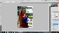
I decided to call my magazine for Wyke 6th Form College “Wyke Town” and the image supports this by looking like a small village behind it with the paths, tree and buildings etc. On my front cover for the Wyke College magazine, there is use of the conventional large font title followed by a smaller font size to highlight the main articles. There is also a non-bold explanation text underneath the title which states the college’s slogan “freedom to achieve”. The clarity of the colour scheme (purple, green and white) acts as a connotation to show the magazine is a light-read and the college itself is a fun place to be – it is a place social and relaxing but also a place of work. The same font is used on the front cover for each element and the colours are not associated with either females or males, this helps include the range of the target audience. The main image fills the front page, is simple and represents the college and the students that study there in a positive way. The subject in the image highlights that the target audience is teenagers (16-18) – she is also looking happy which connotes enthusiasm of progression into further education. The image follows the brief (the image must be an MCU, consisting of just the head and shoulders) – she is also making eye contact with the audience. The medium-shot enables us to see the expression as well as posture of the student whilst also featuring the college environment in the background in an appealing way with nice weather – the casual attire connotes that she is a stereotypical teenager. The text uses anchorage by featuring a college student to make it relevant to the purpose of the magazine and its target audience. The date of publish is shown in this masthead to show it is an up-to-date copy of the college magazine. The barcode is also featured on the page.
The plan of the contents page is presented with a few images of the grounds which include a couple of students. There is a clear heading and the colour scheme is followed through. The style and size of the text is easy to read and links to the front cover and can be used throughout the entire magazine.

Draft of Contents Page

Tuesday, 1 November 2011