Thursday, 15 December 2011

I put a drop shadow on each short line which seemed to be more effective, and I also changed the blending option of the word 'Chelsea' so it became bolder.
I moved the barcode to the bottom corner to make it less significant.
I used 'colour' blending option for the red shape, I attempted it with solid colour but it stood out too much and took attention away from the other features on the cover. I also added the price.
I put a box shape around the name in order for it to stand out more from the rest of the text. I also put the name of the artist 'Chelsea' in a different font and colour.

Friday, 9 December 2011


I used an online barcode generator to make an original barcode

Tuesday, 6 December 2011

I duplicated the title layer and inverted it. I then used the eraser tool to delete the bottom half of the text to create a mirrored effect, almost like a reflection.
I changed the font because I thought this was almost like the 'ACDC' font and looked more 'rock' and iconic.
I have changed the colour scheme to red and purple because I think this stands out more than the blue becasue the blue title blended in too much with the blue highlight's I have edited into her hair. I also changed the inner glow to 24 px in size which is black.

I created the title using an inner glow at 75% opacity and and outer glow at 100%. I chose the colours blue and white.
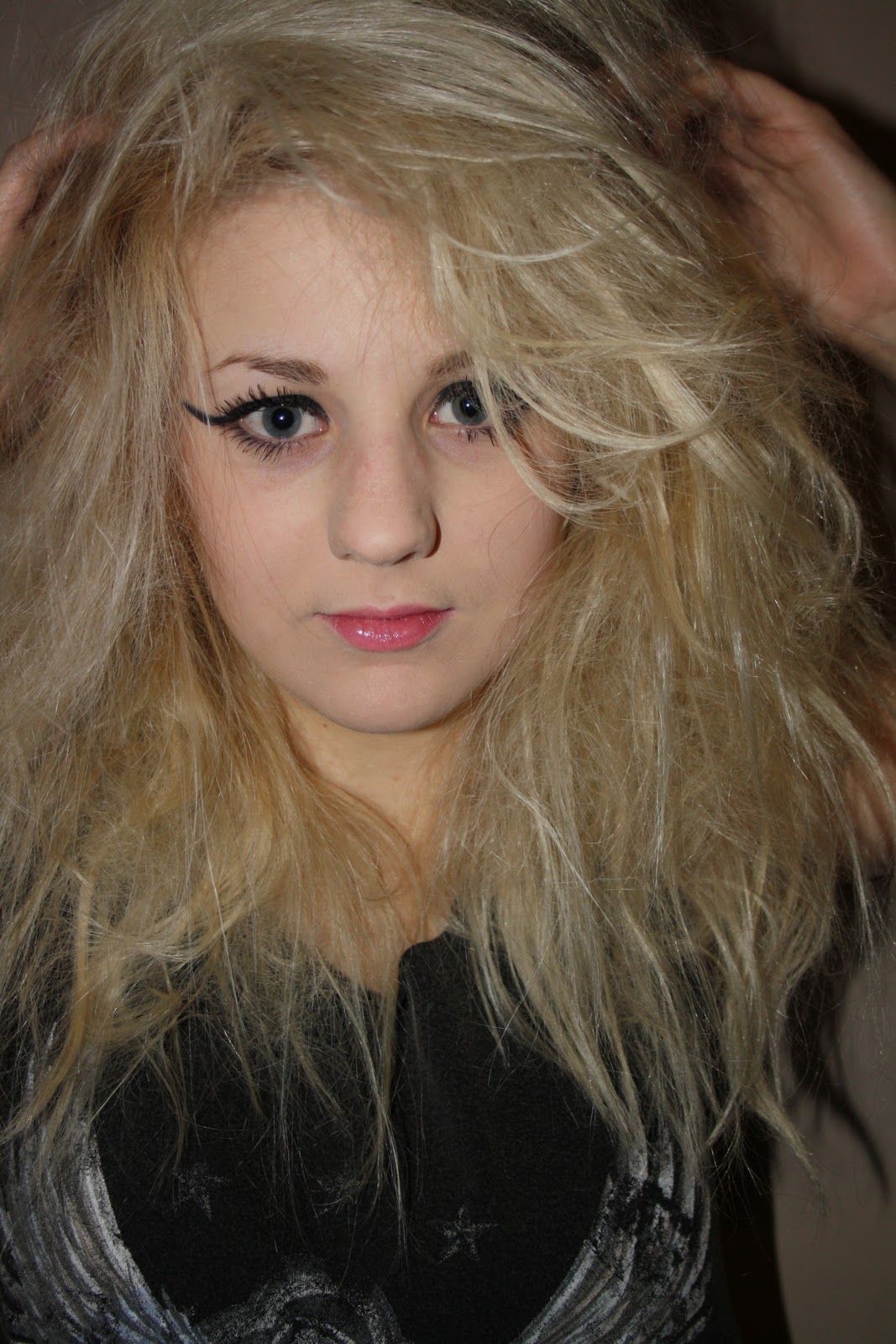
I have adjusted the levels and curves of the image to make it brighter and more prominent. Using the burn tool, I enhanced the make-up on the lips and eyes as well as around the edges of the entire page in order to frame the image. I have also made the colour of her eyes a lighter colour with the burn tool in order for them to stand out more.
I added blue highlights to her hair to fit the genre more using the brush tool. I had to change the opacity of the brush throughout to make some areas look richer in colour than others.

This is the image I have chosen to be on the front cover

Original Images